Design Systems That Actually Work

Structure first. Everything else follows.

Build like you'd furnish a space—thoughtfully, with clear levels of importance, and systems that have room to breathe.

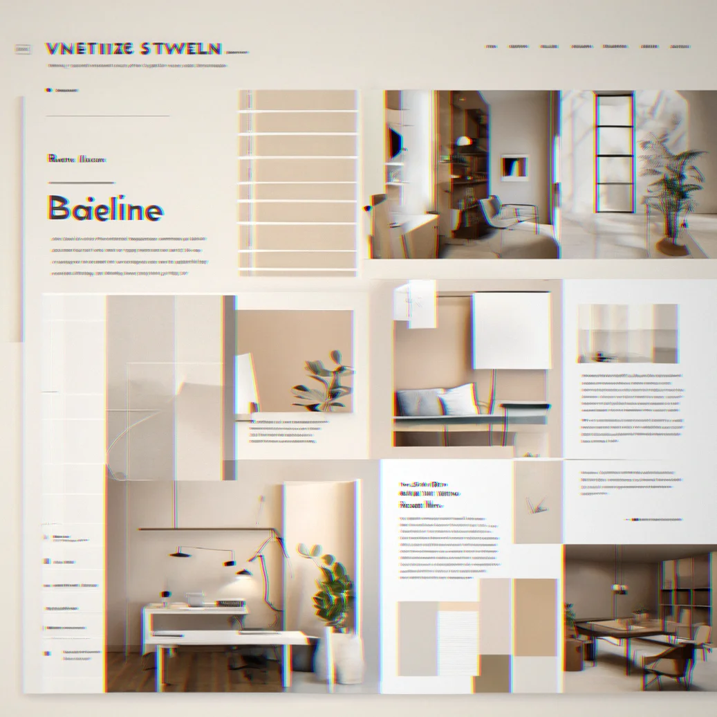
Wireframe showing a spatial grid with baseline alignment and how components stack together

Softframe gives you the framework to turn how you think about space into a working system. No prefab templates. No chasing what's trending this month. Just clear rules, predictable relationships and tools that feel like part of how you already work. Building a design system for your team or launching a client project that actually matches your vision—the grid is there to make things clearer, not to get in the way.

What Softframe Does

Six ways structure clarifies your design thinking.

Spatial Systems, Not Pixel Tweaking

Pick a base unit—8px, 10px, whatever works for you. Everything flows from there. Padding, margins, gaps all follow the same ratio. Shift the base and the whole thing rebalances automatically. No tedious manual fixes.

Component Architecture

Build components like you're building something real. Base, variant, composite. Mark every state clearly: hover, active, disabled, loading, error. Open it six months later and it reads like instructions. No detective work needed.

Tokens as Single Source of Truth

Lock in your type scale, colors, and spacing ratios once. Change one token and it updates everywhere at once. Figma, code, docs—all three stop saying different things.

Typography and Color as Structure

Type scale isn't decoration. It's a ladder with set steps. Heading 1 goes here, body text goes there, and the space between them means something. Color works the same way. Set rules, follow them, stop second-guessing whether it looks right.

Responsive Patterns That Inherit Your Logic

Breakpoints aren't random. They're built on the math you chose. Mobile, tablet, desktop each scale your base system instead of throwing it out. Your structure holds at every size.

Export, Document, Sync

Send it to code. Export as JSON, CSS, or design token format. Docs generate themselves. Sync back to Figma and everything stays aligned. The system is the source. Everything else just follows along.

Design Tokens That Scale

Instead of picking type sizes whenever you need them, you define a set once and stick to it. Same with your color palette. Once it's locked in, you reference those tokens everywhere—your Figma file, your code, your docs. Change one thing and it ripples through everything else. That's what a real system feels like.

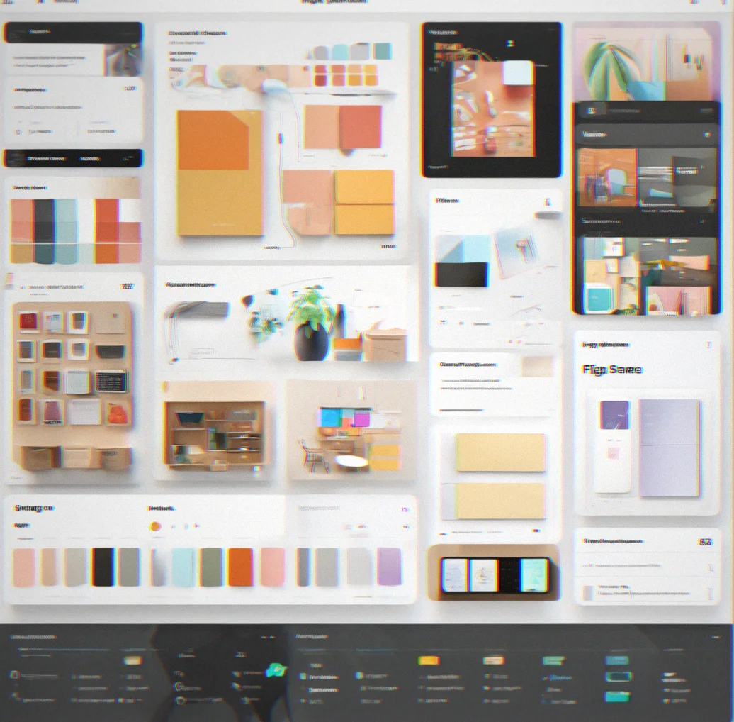
Design tokens panel showing type scale, color palette, and spacing values organized hierarchically

Component Variants Built on Rules

You design a button once. Then you handle the variations—different sizes, colors, states. The system works out all the combinations that actually make sense, not some endless explosion of options. Your developer gets clean, usable exports. You get to look back later and understand what you were thinking.

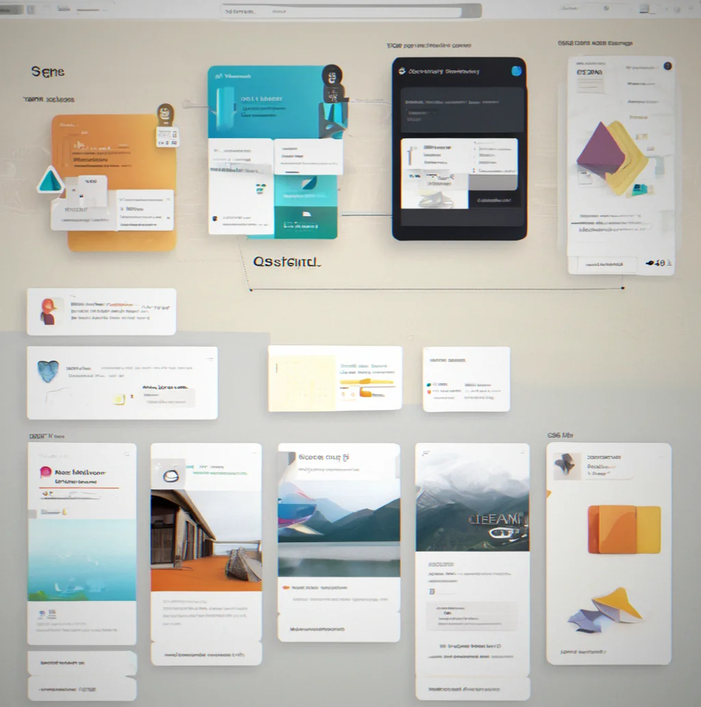
Button component showing base state with size and color variant combinations displayed in a grid

Spatial Rhythm That Holds

Your baseline grid isn't just for show. Pick a base unit—8 pixels, 10, whatever makes sense for your project. Every margin, padding, and gap then follows that same ratio. If you need to adjust it later, the whole layout recalculates. Nothing breaks.

Layout grid showing baseline alignment with consistent spacing intervals and component placement

Export. Document. Keep in Sync.

Export to JSON, CSS, or whatever format your tools speak. Documentation builds itself. You can sync it back to Figma so your tokens don't drift between design and code. There's no translation step in between. It's one source that feeds everything.

Export menu showing multiple format options with documentation preview and sync status indicator

How Softframe Works

Six essentials. Nothing more.

Define Your Base Unit

Pick 8px or 10px. That's it. Evreything else—margins, padding, gaps, line heights—comes from that one number. Change the base and the whole layout shifts. One tweak, not a dozen.

Build a Type Scale

Not random sizes. A ladder. H1 sits on one rung, body text on another. Use a ratio: 1.25x, Fibonacci, whatever math works for you. Consistency without the thinking.

Set Your Color Rules

Start with a palette. Then add contrast minimums, semantic meanings (primary, secondary, error, success), opacity steps. Follow the rules instead of gut feel. Though gut feel matters when you're picking the palette.

Create Components Once

Button. Card. Input field. Name them clearly, document the states (hover, active, disabled, loading), decide on sizes. Stop building the same thing twice.

Export to Code and Docs

JSON, CSS, design tokens format. Documentation builds itself. Developers get structured data, your team gets a reference. No middle step needed.

Keep Everything Synced

Change a token in Softframe and it updates in Figma, code, and docs. One place where the truth lives. Not three systems that ignore each other.

Softframe System in Action

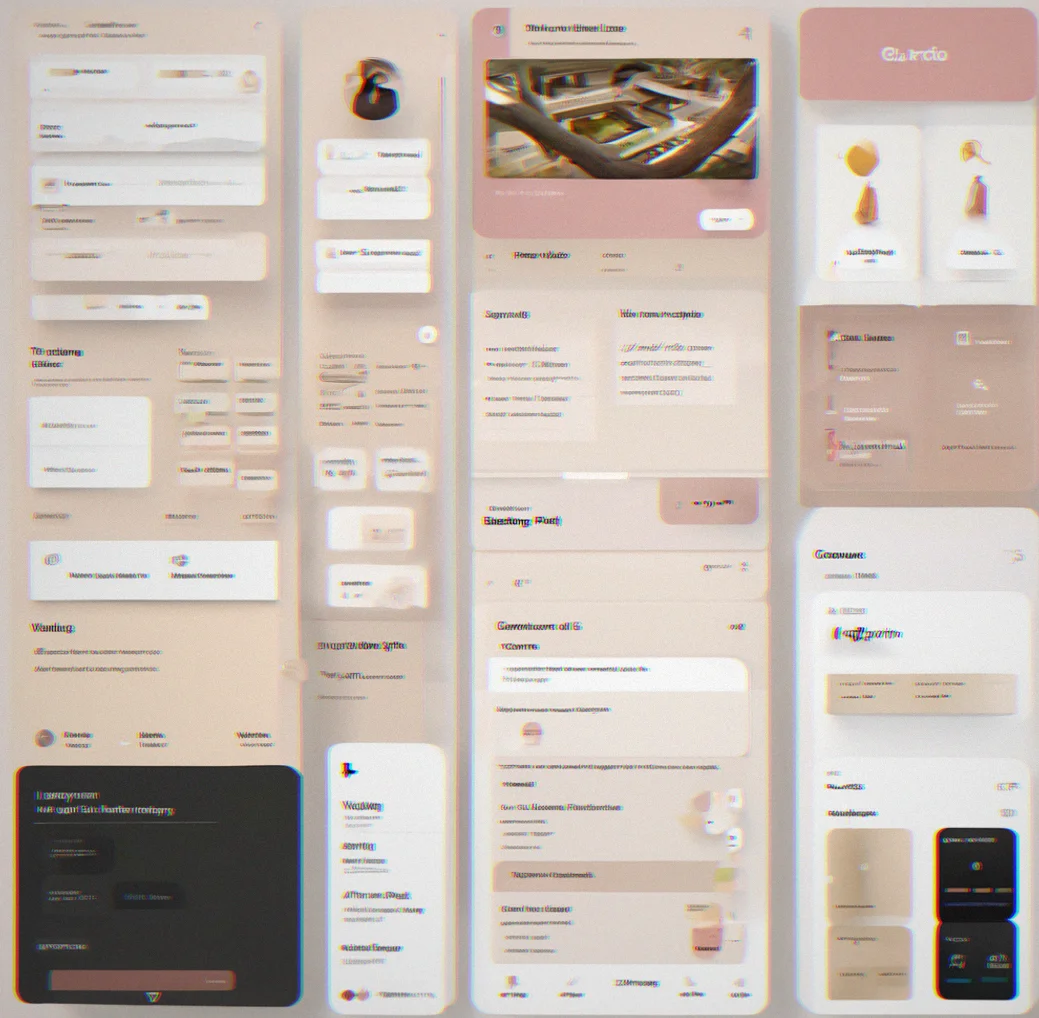
The design tokens panel in the desktop interface, showing your type scale, colors, and spacing all organized in one place
Your component library with a button base, including all the size and color variants plus different states you might need
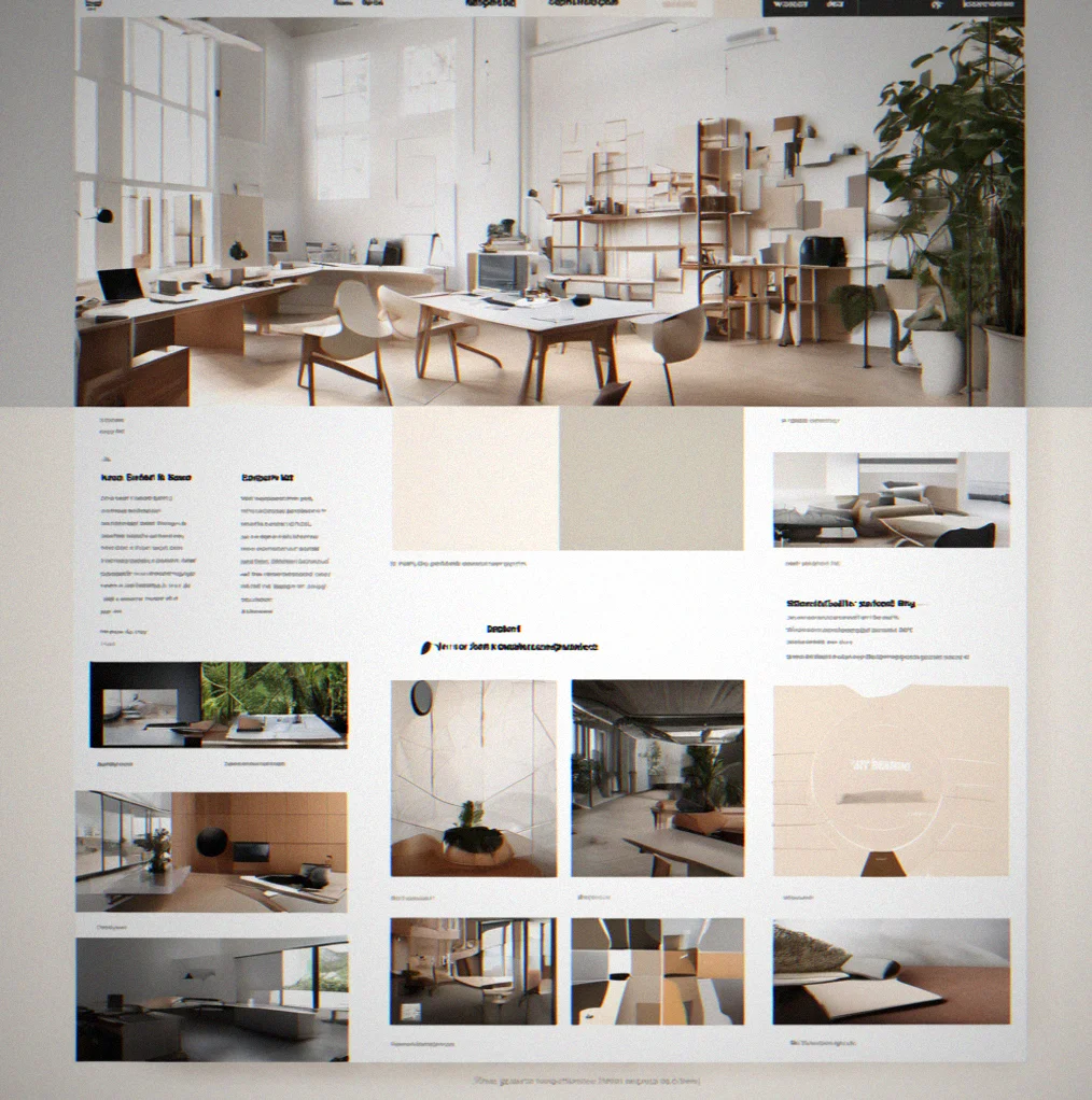
A website layout with grid overlay showing how everything aligns to the baseline, the spacing pattern, and where each component sits
Exporting your tokens as JSON, which includes all the token definitions and lets you generate documentation at the same time
Inside Figma with the component variants panel open, showing how your tokens stay synced and your naming system is consistent
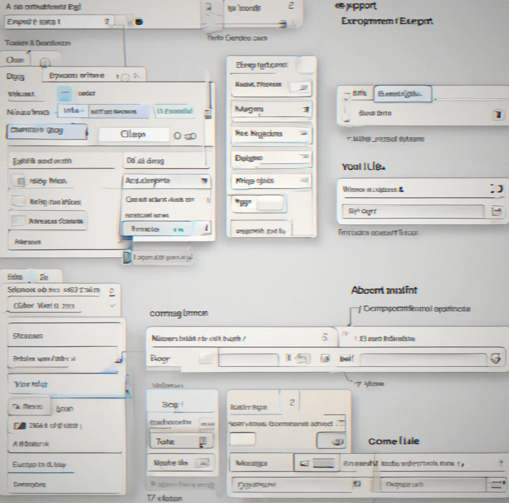
The export interface where you can grab your tokens in CSS, JSON, or design token format, with a status indicator so you know everything is in sync
The design tokens panel in the desktop interface, showing your type scale, colors, and spacing all organized in one place

Design Systems in Motion

What does intentional design actually look like? The grid stays locked across every breakpoint. Tokens shift everywhere at the same time. The type scale has room to breathe. This is how it plays out when you're actually building something.

A hierarchical list of design tokens laid out by type sizes, colors, spacing, and border radius. Everything's grouuped by what it does.

A hierarchical list of design tokens laid out by type sizes, colors, spacing, and border radius. Everything's grouuped by what it does.

Base button component with all its size variants shown next to it. Small, medium, large. Each one's got color options and different states marked out.

Base button component with all its size variants shown next to it. Small, medium, large. Each one's got color options and different states marked out.

A website layout with a grid overlay showing how spacing and padding line up. Cards and text blocks all sit on the same baseline.

A website layout with a grid overlay showing how spacing and padding line up. Cards and text blocks all sit on the same baseline.

Export options panel with JSON, CSS variables, and design token formats available. You can see a preview of what the generated docs will look like.

Export options panel with JSON, CSS variables, and design token formats available. You can see a preview of what the generated docs will look like.

Figma file with a synced component library. Token values are linked and naming stays consistent across buttons, cards, and inputs.

Figma file with a synced component library. Token values are linked and naming stays consistent across buttons, cards, and inputs.

Building With Systems

A basic interface with a single input field for your base unit set to 8 pixels. Below that you can see the full spacing scale it generates, stepping up from 8px all the way to 128px in consistent increments
Type scale laid out vertically showing all six heading levels plus the body text variants. Each one scales up from the last by the same ratio, so it all feels proportional
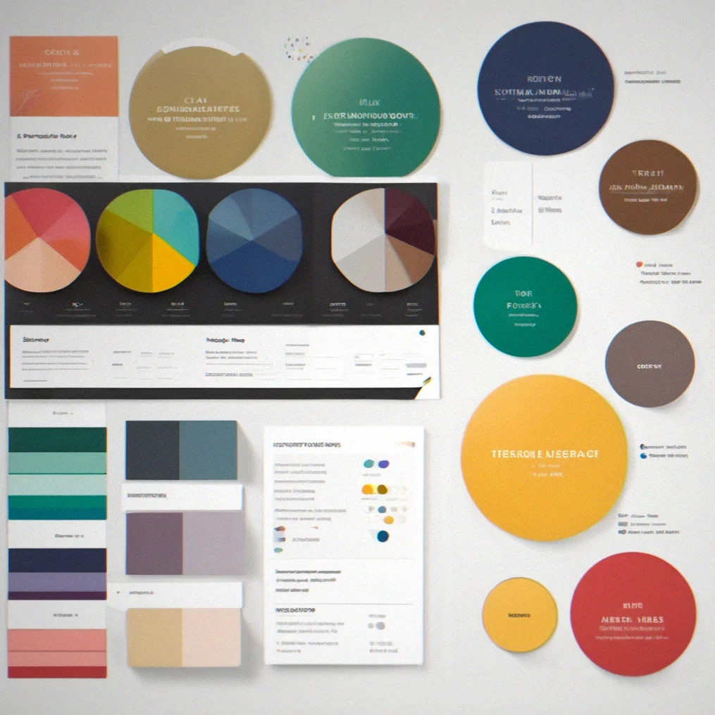
Color palette with your primary, secondary, and neutral colors all lined up with their hex codes next to them. You also get semantic labels built in for success states, warnings, and errors
List of base components like buttons, cards, input fields, and modals. Each one shows how many variants you've created and what state options are available [actually more useful than it sounds]
Grid overlay on top of a live site showing how the baseline spacing holds up across mobile, tablet, and desktop without the whole thing falling apart
Export dialog with a few format options. You can see a JSON preview ready to hand off to developers, complete with all your token definitions, component structure, and naming scheme
Figma library panel showing your synced design tokens with a live connection indicator. When you change a token value, all the component variants update automatically

How It Works

Systems Don't Constrain—They Clarify

Design tokens interface showing type scale, spacing values, color palette with hex codes and semantic labels for difrerent states
Component library with button base, size variants, and color combinations showing hover active and disabled states

A design system isn't a cage. It's a language. When you set a base unit, a type scale, a color palette, you're not limiting creativity—you're giving yourself grammar to work with. Every architect gets this. Constraints let you move fast without constantly questioning yourself. You pick your grid, your proportions, your materials, then design within those bounds. The bounds make it possible.

Softframe takes that architectural approach and turns it into a digital system that stays consistent across code, design, and documentation. Define the rules once—8px base unit, 1.25x type ratio, HSL color values with contrast minimums—and every component, every page, every export follows those rules. Change one token and the whole system recalculates. Not manually. Not bouncing between three different tools. It happens here.

This matters because teams grow. Today it's just you. Next week there's three designers and two developers. Someone new shows up later and needs to know why things were built the way they were. They don't have to reverse-engineer it. The system is the documentation. The structure tells you what you need to know.

Spatial Logic

Set your base unit once. Every margin, padding, and gap comes from that one number. Responsive breakpoints use the same math.

Token Sync

Change something in Softframe and it flows to Figma, code and docs at the same time. One place to update instead of managing three separate systems.

Export Ready

Output to JSON, CSS variables, or design tokens format. Developers get structured data. Your team gets something they can actually reference.

Questions

Frequently Asked

Most of these show up after the first week. Some people ask them immediately. Just what we actually get asked.

Yeah. Send a CSV or JSON with your tokens—type sizes, colors, spacing, whatever you have—and we'll set it up in about ten minutes. Naming might need tweaking, but your actual values don't change.

Just change the number in settings. Everything Recalculates automatically—margins, padding, gaps, all of it. Components stay proportional. That's the whole reason to use a system like this.

Yep. Export to JSON or CSS for Webflow, keep Figma synced through design tokens. Softframe holds everything and distributes it where you need it. Some people run it with code too, but Webflow works fine.

Define your constraints—base Unit, type scale, color palette, spacing ratios—in roughly an hour. Then spend a couple more hours building core components. After that you're live. We're talking days, not weeks.

On the Agency plan, yes. Lock down the system so tokens and components stay fixed. Clients can only touch text, images and colors. The structure won't drift.

Starter runs $29 monthly and covers 3 projects, 50 components and 1 team member. Studio is $79 for unlimited projects and 5 team members. Your data moves with you. Nothing gets lost.

Open beta launched in July 2026. Starter and higher tiers get it. Pull tokens, component data and docs programmatically instead of the export-and-reimport dance.

Stay in the loop on new features, system thinking, and design craft. No fluff.

Digest lands every two weeks. Mostly covers deisgn systems, spatial thinking, and using structure to make better decisions. We skip the product announcements unless they actually matter.